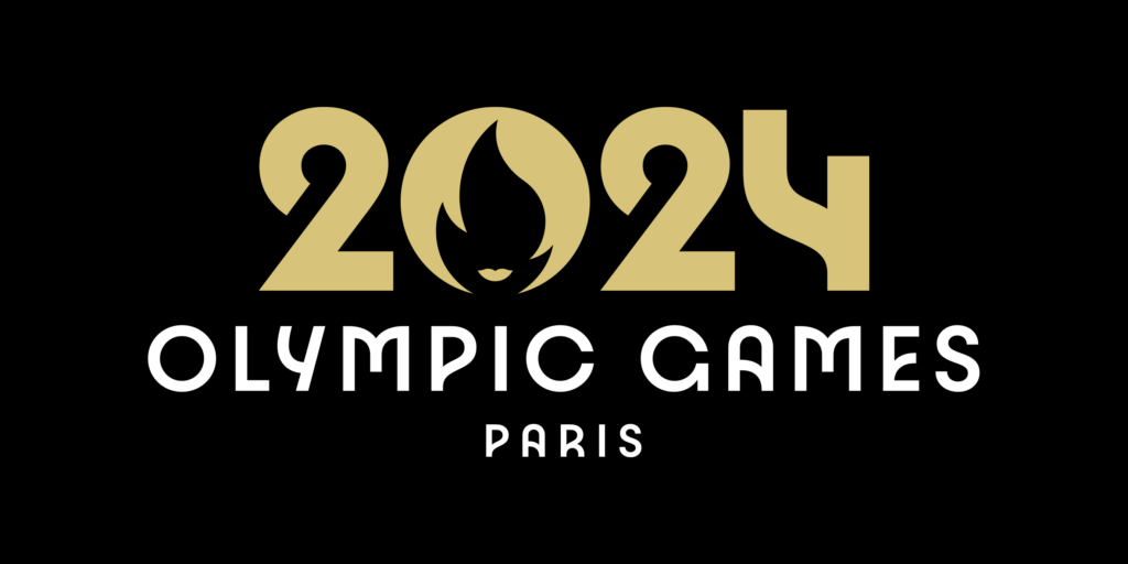
PARIS 2024 – OLYMPIC GAMES:
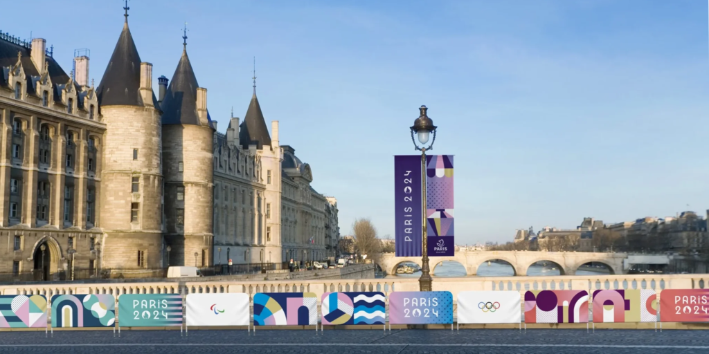
there is still a little more than a year left for the 33rd edition of the Olympic Games in Paris 2024 to take place and the organization has already presented the emblem and the visual system, which will identify everything that has to do with the event.

identity and visual system of Paris 2024
the new design (chosen by interagency competition, has been made by Royalties Ecobranding), brings together three iconic symbols related to sport, Games and France: the gold medal, the Olympic and Paralympic flames and Marianne, the incarnation of the French Republic and its values of liberty, equality and fraternity.
from the Olympic Committee, they affirm that the new emblem: “perfectly reflects their vision and desire to put people at the heart of the Paris 2024 Olympic Games”.
the combination of the gold medal, the Olympic flame and Marianne unites the values, the history and the French touch that will make these Olympic Games truly special. International Olympic Committee Coordination Commission Chair for the Olympic Games Paris 2024, Pierre-Olivier Beckers-Vieujant, said: “I think this innovative design will be quickly recognized around the world and will be a wonderful calling card.”
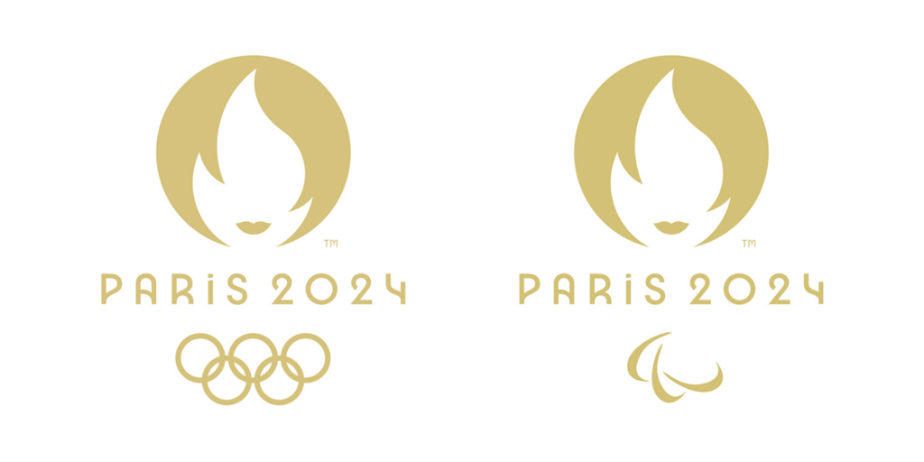
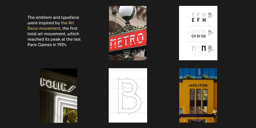
as a novelty, this will be the first time that the emblem will be the same for the Games Olympics and Paralympics. the logo of Paris 2024 will only be differentiated by the rings Olympic or Paralympic agitos, which will appear below. on the other hand, the brand yields tribute to Paris as the host city of the Games, since its pure and discreet lines and its original typography are inspired by Art Deco, the first complete artistic movement, which reached its apogee at the 1924 Games in Paris. a creative use of negative space, a simple and impactful design, a very timely, historical different typography, worked and inspired by its context, a circular, balanced composition. in short, many ingredients worked with intelligence and mastery, at the height of what is expected of the image of some Olympic Games.
Paris 2024, pictograms:
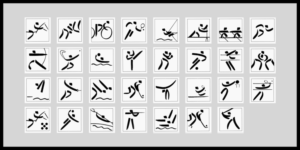
symbolism and historical references in the visual identity of Paris 2024, are very present in the graphic system of the competition. thus, the pictograms of the next Olympic Games are transformed into coats of arms, with a more graphic representation typical of heraldry. the pictograms presented break with the functional paradigm that has characterized these pieces from 60 years ago, when Musaru and Yamashita created the system of Tokyo 1964 pictograms.
the set created now, shows elements of each sport as a kaleidoscope, where shapes drawn in line and fill, are repeated in a composition apparently symmetrical. in some applications, the designs are framed by a circle or shield.
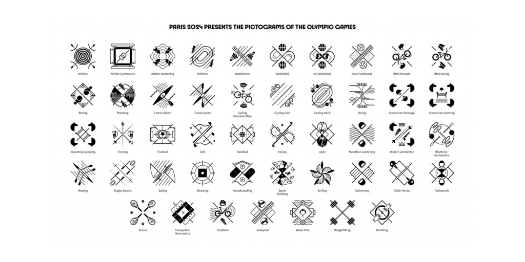
Julie Matikhine, brand director of the Paris 2024 Olympic Games, has made it clear that the first objective of the designs has been to avoid a replica of the pictograms made up to that time. moment, whose compositional scheme has remained unchanged over the years.
in fact, Matikhine spoke at the presentation of coats of arms and not of pictograms. in a true declaration of principles, he declared: “pictograms belong to the past, we launched the shield as a principle”. this break, according to the design team, is based on the need to connect with the young people and their way of communicating. an important aspect for Olympic committees (French and International), very interested in attracting consumers to the games, given that event after event the figure decreases. the profile of the potential public has changed, the Television has lost its predominant place in the audiovisual sector and the Internet, with the networks little by little, is taking its place. the new design therefore has a more emotive than indicative function. it’s a graphic intended for artifice, not for service.
pictograms: history and evolution in the Olympic Games.
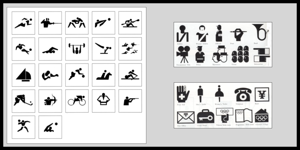
+Tokio 1964: minimalist pictograms, as substitutes for verbal language.
pictograms have been key in the visual identity of the Olympic Games, as part essential for space and media signage. during the preparation of the Tokyo 1964 Games, the use of pictograms was raised for the first time, in a context signage, to help in the orientation of athletes, journalists and the public attending out of the country.
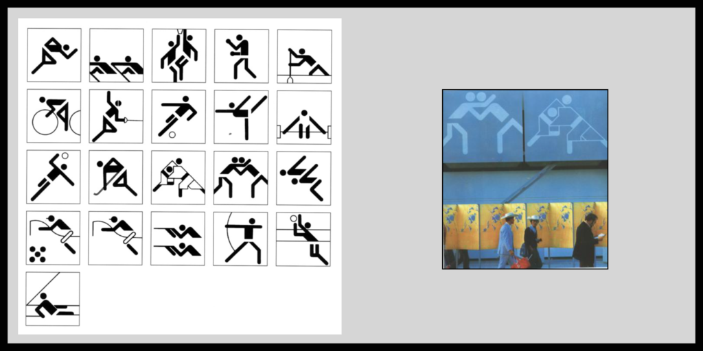
+Munich 1972: the pictograms of synthesis and rationalism.
in 1972, Gerhard Joksch took another turn of the screw and drew some pictograms for the Games very geometric Munich, which took the synthesis and rationalism of 68 to its maximum expression. probably Joksch’s design, wrongly attributed to Otl Aicher —Art Director of those games, is the most famous in the history of the Games. is also the only system repeated in other summer games, those of Montreal 76.
+Barcelona 1992:
+Paris 2024: stage of rupture.
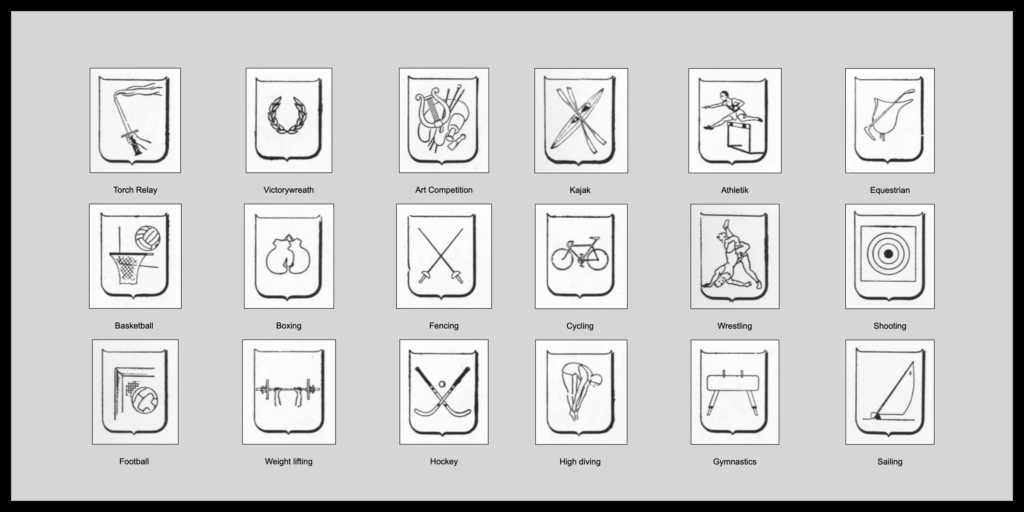
despite everything, Paris 2024 definitely forgets pragmatism and chooses to consider these representations as a merely decorative resource. a favored change, in part, due to the evolution of technology, which makes any signaling plan unnecessary meticulous and makes it possible to give greater or total prominence to the form, to the detriment of the function. now we are easily located with a mobile or have a translator on it. paradoxically, this movement does not suppose anything new. in games prior to 1964, illustration was already used as a decorative procedure to represent the different sports disciplines.
Olympic Games in Paris 1924, London 1948, Helsinki 1952 or Rome 1960, had families of drawings very similar to pictograms, but without the synthetic rigor or practical background of these were illustrations that mainly decorated printed materials, such as programs, brochures or tickets.
we could conclude that the designs presented cannot be considered as a system of pictograms, not only in the Olympic context, but in general, since they do not comply with basic principles that define these: graphic conciseness, ease of recognition or conventionality. the new designs represent a clear break with some graphics conventions, being able to become a custom, to the grief of lovers of movement modern —still surviving in the pictograms— and design with sense.